The correlation coefficient is very useful for understanding how strong the linear relationship is between two variables. The only problem is that it is quite messy and tedious to find by hand! And as I have mentioned many times before: statisticians do not find these things by hand. They interpret the results from software or other calculators.
[adsenseWide]
For most students, the easiest way to calculate the correlation coefficient is to use their graphing calculator. It is a VERY easy process an here, I will go through each of the steps needed. (For a video that shows all of these steps, be sure to scroll down!)
Step 0: Turn on Diagnostics
You will only need to do this step once on your calculator. After that, you can always start at step 1 below. If you don’t do this, r will not show up when you run the linear regression function.
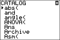
Press [2nd] and then [0] to enter your calculator’s catalog. Scroll until you see “diagnosticsOn”.
Press enter until the calculator screen says “Done”.
This is important to repeat: You never have to do this again unless you reset your calculator or start using someone elses! This will be set up from now on.
Step 2: Enter Data
Enter your data into the calculator by pressing [STAT] and then selecting 1:Edit. To make things easier, you should enter all of your “x data” into L1 and all of your “y data” into L2.
Step 3: Calculate!
Once you have your data in, you will now go to [STAT] and then the CALC menu up top. Finally, select 4:LinReg and press enter.
That’s it! You’re are done! Now you can simply read off the correlation coefficient right from the screen (its r). Remember, if r doesn’t show on your calculator, then diagnostics need to be turned on. This is also the same place on the calculator where you will find the linear regression equation, and the coefficient of determination.
Video
The following video will walk you through the steps you see above!
Only the truly insane (or those in an introductory statistics course) would calculate the standard deviation of a dataset by hand! So what is left for the rest of us level headed folks? Statisticians typically use software like R or SAS, but in a classroom there isn’t always access to a full PC. Instead, we can use a graphing calculator to perform the exact same calculations. Note: You can scroll down for a video walkthrough of these steps.
[adsenseWide]
Standard Deviation on the TI83 or TI84
For this example, we will use a simple made-up data set: 5, 1, 6, 8, 5, 1, 2. For now, we won’t concern ourselves with whether this is sample or population data. This will come up later in the steps.
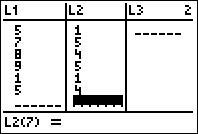
Step 1: Enter your data into the calculator.
This will be the first step for any calculations on data using your calculator. To get to the menu to enter data, press [STAT] and then select 1:Edit.
Now, we can type in each number into the list L1. After each number, hit the [ENTER] key to go to the next line. The entire dataset should go into L1. If for some reason, you don’t see L1, see: Getting L1 on Your Calculator.
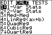
Step 2: Calculate 1-Variable Statistics
Once the data is entered, hit [STAT] and then go to the CALC menu (at the top of the screen). Finally, select 1-var-stats and then press [ENTER] twice.
Step 3: Select the correct standard deviation
Now we have to be very careful. There are two standard deviations listed on the calculator. The symbol Sx stands for sample standard deviation and the symbol σ stands for population standard deviation. If we assume this was sample data, then our final answer would be s =2.71. Pay attention to what kind of data you are working with and make sure you select the correct one! In some cases, you are working with population data and will select σ.
What about the variance?
The variance does not come out on this output, however it can always be found using one important property:
I have been a fan of Wolfram Alpha from the very beginning. While there have been some changes I am not happy with (ads – no solutions without an account), there have also been several I love. One of those is the way they have reorganized things to make some really nice online statistics calculators.
Now, there are already a few online t-test calculators out there, but none of them seems to have the same amount of information or the same “ease of use”. To show you what I mean, I am going to make up a silly example that we can try out.
The mean weight of purses carried by students at a college is thought to be less than 10 pounds. In a random sample of 35 students from this college who carried purses, the average weight was 8.3 pounds with a standard deviation of 3.9 pounds. At a significance level of 0.05, is there evidence that the mean weight for all such students is less than 10 pounds, as thought?
As you can see, we are testing a hypothesis about the mean and do not know the population standard deviation. If our data is mostly symmetric or we have a large enough sample, we can use a t-test. Usually we would talk much more about assumptions and such but for the sake of this post, we aren’t focused on the theory. So, on to the calculations!
Step 1: Go to http://www.wolframalpha.com and type in “t-test”
I completely admit that this is a much bigger step than step 1. Before we can enter any information, we need to figure out our hypotheses and what information we have. We are testing the hypothesis that the mean weight of purses for all students at this college is less than 10 pounds. This would represent an alternative hypothesis of H_{a}: \mu < 10[/latex]. In other words, our hypothesized mean is 10.
Next, we look closer at the problem and see the sample mean was 8.3 pounds and the sample standard deviation was 3.9 pounds. This all came from a sample of 35 students. Since that is all gathered, we are ready to input!
Notice how a little equal appears as we input data? Clicking that takes us to step 3.
Step 3: Interpret the output
After pressing that equals sign, we will get the following screen:
There is actually more which you can see if you press the link above. For this problem though, we have all the information we need. Notice the default output is the p-value and test statistic for a left tailed test. This can be adjusted by clicking the right tailed test or two tailed test buttons in the upper right of the output.
But we had a left tailed test as you can see by the alternative hypothesis given. Therefore, our p-value is 0.007 < and we reject the null hypothesis. So, we do in fact have evidence to support the original belief that the average purse weight will be less than 10 pounds. We could have also made this decision using the test statistic output.
As you can see in the video, it can also be used for other types of hypothesis tests! Nice!
Typically, statisticians are going to use software to help them look at data using a box plot. However, when you are first learning about box plots, it can be helpful to learn how to sketch them by hand. This way, you will be very comfortable with understanding the output from a computer or your calculator. In the following lesson, we will look at the steps needed to sketch boxplots from a given data set.
[adsenseWide]
Example data
Remember, the goal of any graph is to summarize a data set. There are many possible graphs that one can use to do this. One of the more common options is the histogram, but there are also dotplots, stem and leaf plots, and as we are reviewing here – boxplots (which are sometimes called box and whisker plots). Like a histogram, box plots ignore information about each individual data value and instead show the overall pattern.
To review the steps, we will use the data set below. Let’s suppose this data set represents the salaries (in thousands) of a random sample of employees at a small company.
7 14 14 14 16
18 20 20 21 23
27 27 27 29 31
31 32 32 34 36
40 40 40 40 40
42 51 56 60 65
Steps to Making Your Box plot
Step 1: Calculate the five number summary for your data set
The five number summary consists of the minimum value, the first quartile, the median, the third quartile, and the maximum value. While these numbers can also be calculated by hand (here is how to calculate the median by hand for instance), they can quickly be found on a TI83 or 84 calculator under 1-varstats. The video below shows you how to get to that menu on the TI84:
For this data set, you will get the following output:
Step 2: Identify outliers
Other than “a unique value”, there is not ONE definition across statistics that is used to find an outlier. As you study statistics, you will see that different settings will use different techniques to flag or mark a potential outlier. With boxplots, this is done using something called “fences”. The idea is that anything outside the fences is a potential outlier and shouldn’t be included in the main group that we graph. Instead it will be marked with a asterisk or other symbol.
The lower fence
Any data value smaller than the lwoer fence will be considered an outlier. The lower fence is defined by the following formula:
\(\text{lower fence} = Q_{1} – 1.5(IQR)\)
This formula makes use of the IQR, or interquartile range. This is defined as:
\(\text{IQR} = Q_3 – Q_1\)
Using the calculator output, we have for this data set \(Q_1 = 20\) and \(Q_3 = 40\). This gives us:
The largest value in the data set is 65, so this means there is no upper (large) outlier.
Since there were no small or large outliers in the set, we can conclude there are no outliers overall.
Step 3: Sketch the box plot using the model below
The main part of the box plot will be a line from the smallest number that is not an outlier to the largest number in our data set that is not an outlier. If a data set doesn’t have any outliers (like this one), then this will just be a line from the smallest value to the largest value. The rest of the plot is made by drawing a box from \(Q_{1}\) to \(Q_{3}\) with a line in the middle for the median. As a general example:
Additionally, if you are drawing your box plot by hand you must think of scale. In this data set, the smallest is 7 and the largest is 65. So starting the scale at 5 and counting by 5 up to 65 or 70 would probably give a nice picture. Then, since none of these are outliers, we will draw a line from 7, which is the smallest data value to 65, which is the largest data value. Finally, we will add a box from our quartiles (\(Q_1 = 20\) and \(Q_3 = 40\)) and a line at the median of 31. All together we have:
Of course, a software version will look quite a bit better. Also note that boxplots can be drawn horizontally or vertically and you may run across either as you continue your studies. As an example, here is the same boxplot done with R (a statistical software program) instead:
Summary
Remember – pay attention to how these box plots are put together in order to do a better job at reading the information they provide. Since you now know that middle line is the median, you can just look at the box plot and know that 50% of the salaries were less than $31,000 or so. As you can see, a box plot can not only show you the overall pattern but also contains a lot of information about the data set. To see more about the information you can gather from a boxplot, see: How to read a boxplot
The TI83 and TI84 graphing calculators give us a nice and easy way to get a histogram in order to see the overall pattern of a data set (which is the goal of any histogram!). In this guide, we will go the whole process step by step. As we work through this, you might find it useful to download this Histograms on the Calculator Cheat Sheet (PDF) (just right click and select save as).
To get to the lists in your calculator, press STAT and then choose 1:EDIT. There are several lists to choose from but L1 is the default list on the other menus. This means that if you use L1, you will have less stuff to change in the calculator later.
To enter data, type the number and then press ENTER. Again, it is really important that all of the data goes into one list – even if in your book it is in different columns.
Go into StatPlots and Select the Histogram
Once the data is entered, press 2ND and then Y= to get in the statplot menu. Under this menu, go into plot 1 (you can use any plot, but again, this is the easiest to work with) and turn the plot on. Once the plot is on, select the histogram by highlighting it and pressing enter, and make sure the list says L1. If you used a different list, you will have to change the list here. Finally, leave “frequency” as 1.
Use ZOOMSTAT to view your histogram and TRACE to see the classes and frequency.
Once your plot is on, press ZOOM and then #9 ZOOMSTAT to see your graph. The TRACE button allows you to see what the groups/classes are and the frequency. Often, the class width the calculator uses isn’t very natural. In this example its 8.8. It’s a good idea to change this to something that is easier to work with and in this example I decided to change this to 9.
To do this, you press WINDOW and adjust the number next to XSCL. Once you do this, press GRAPH to see your changes since pressing ZOOMSTAT will make the calculator recalculate everything.
In the last image, “n” is the frequency of the class denoted by the two numbers in the inequality. For example, the highlighted class in the last picture goes from 12 to 21 and has a frequency of 8.
The video below will walk you through the same example above. Review this to make sure you understand how this all works!
What if there is an error?
If you get all the way to the end and then your graph won’t show up, I would make sure there is nothing under “Y=”. Sometimes when you walk around, your calculator accidentally gets turned on and a bunch of stuff can get pressed and typed under Y=. If this doesn’t fix it, I would then make sure everything is under L1 and not some other list. You can reset your list by clicking STAT, EDIT, SETUPEDITOR if you have a weird menu.
Generally, statisticians (and any sane person) will use some kind of statistical program like R or minitab to make their statistical graphs. However, it is still surprisingly common to see textbooks do everything by hand and in the end, learning how to make a histogram by hand is a great way to get better at reading them and figuring out what the problem is when a computer or calculator gives you something you don’t expect. In this lesson, we will look at the step-by-step process of making a frequency distribution and a histogram.
To show you how to do this, we will be using the data set below. I went ahead and put the numbers in order which will make everything much easier.
12
14
14
14
16
18
20
20
21
23
27
27
27
29
31
31
32
32
34
36
40
40
40
40
40
42
51
56
60
65
To make a histogram by hand, we must first find the frequency distribution. The idea behind a frequency distribution is to break the data into groups (called classes or bins) so that we can better see patterns. It is sort of like the difference between asking you your age and asking you if you are between 20 and 25. In the second question, I am grouping up the ages. This way if I have a HUGE data set (like many are) I can see the patterns (like are most people older or younger) much easier than if I just tried to decipher a large list of numbers.
Steps to Making Your Frequency Distribution
Step 1: Calculate the range of the data set
The range is the difference between the largest value and the smallest value. We need this to figure out how much “space” we need to divide into groups. In this example:
\(\text{Range}=65-12=53\)
Step 2: Divide the range by the number of groups you want and then round up
Doing this allows us to figure out how large each group is. It’s as if we are going to cut a board into equal pieces. In step 1, we measured how long the board is and now we are deciding how big each piece will be.
Hmmm… but how many groups to have? Too many, and our graphs and tables won’t be much better than a list of numbers. Too few, and the pattern will be hidden with too little detail. Often, a good number of groups is 5 or 6 although there are some rules that people use to decide this. MORE OFTEN, people will let the computer decide and then adjust if they want to while textbooks will tell you how many groups to use. But if you are working with the dataset yourself, you will have to see what the graph looks like before you can be sure you chose a good number.
Let’s say that we choose to have 6 groups. If we do this then:
\(\dfrac{53}{6}=8.8\)
The number we just found is commonly called the class width. We will round this up to 9 just because it is easier to work with that way. A computer would probably keep the 8.8 so be aware that sometimes you will see this number as a decimal. NOTE: In general, people who are doing this by hand always round up even if it was 8.1!
Step 3: Use the class width to create your groups
I’m going to start at the smallest number we have, which is 12, and count by 9 until I have my 6 groups. For example, my first group will be 12 to 21 since 12+9=21. My next group will be 21-30 since 21+9=30… and so on. I’ll put these in a table and label them “classes”. I will also add “frequency” to the table.:
Classes
Frequency
12 – 21
21 – 30
30 – 39
39 – 48
48 – 57
57 – 66
Step 4: Find the frequency for each group
This part is probably the most tedious and the main reason why it is unrealistic to make a frequency distribution or histogram by hand for a very large data set. We are going to count how many points are in each group. Let’s start with our first group: 12 – 21. We want to count how many points are between 12 and 21 NOT INCLUDING 21. You see the overlap between the groups right? That’s to account for decimals and we keep it even when we don’t have any. The right hand endpoint of any group isn’t included in that group. It goes in the next group. That means 21 would be in the second group and any 30 we have would be counted in the third group.
Back to the first group: 12-21. I have circled the points which would be included in this group:
Alright – now I update the table with this information!
Classes
Frequency
12 – 21
8
21 – 30
30 – 39
39 – 48
48 – 57
57 – 66
Continuing with this pattern (each group is a different color!):
Classes
Frequency
12 – 21
8
21 – 30
6
30 – 39
6
39 – 48
6
48 – 57
2
57 – 66
2
That last table is our frequency distribution! To make a histogram from this, we will use the groups on the horizontal axis and the frequency on the vertical axis. Finally, we will use bars to represent the the frequency of each individual group. With this data, the finished histogram will look like the one below.
You can see another example of how this is done in the video below.
[adsenseLargeRectangle]
Video example
In this example, we will go through the same process with a different data set.
Probably the most used and most talked about graph in any statistics class, a histogram contains a huge amount of information if you can learn how to look for it. While it is possible to go into great detail about the different shapes you may encounter or where the mean and median will “end up”, this article will only focus on reading the information the histogram is giving you.
The general idea behind a histogram is to divide the data set into groups of equal length which allows us to see the patterns in the data instead of the detailed information we would get from what is basically a list of numbers.
In the histogram of salaries above, those groups are 24-32, 32-40, 40-48, etc. Once the groups have been chosen, the frequency of each group is determined. The frequency is simply the number of data values that are in each group.
Let’s look at the very first group 24-32. The bar goes up to 7, meaning that this group has a frequency of 7. This tells us that there are seven data values (if we had the list of all the salaries) that are between 24 and 32 thousand. In other words, seven people in this group made between $24,000 and $32,000.
Very important: this group does not include the 32. There are seven data values bewteen 24 and 32 thousand, not including 32 thousand. Keeping this in mind and reading from the next group: there are six data values between 32 thousand up to (not including) 40 thousand. Again, this means that six of the people in this group had a salary of $32000 up to $40000 a year. (anyone making exactly $40,000 is in the next group)
Be careful in making more detailed conclusions. While I can say that most people in this group made less than $50,000 (that’s where the most frequency is) I can’t use this graph to say how many people made EXACTLY $35,000 or how many made EXACTLY $25,000. In a histogram we “lose” the information about individual data values when we group the data. If we didn’t want to lose that information we may choose to use a dotplot or a stemplot to display the data instead.
The median is one of the ways we can measure the “center” of a distribution of data. One of the big benefits of the median, is that it is not as affected by outliers and something like the mean is.
Loosely, the median represents the middle value – in other words, about 50% of the values in the data set are less than the median (you know that saying about 50% of “whatever” is below average – well thats not always true!). Let’s look at the different ways to calculate it.
By hand
Finding the median by hand is not usually done by statisticians, but it is a good exercise to use to understand exactly how the median works. You remember how I said that it is the middle value? Well this helps us plan how to find the median but in reality there will be two different cases.
Case 1: There are an odd number of data values. Suppose that my data set is 7, 9, 1, 4, 3. To find the median of this data set, I would write the numbers in order: 1, 3, 4, 7, 9 and the median would be the literal middle value. Med=4.
Case 2: There are an even number of data values. Suppose instead my data set is 8, 2, 1, 5. This time when I order the numbers, there is no clear middle value! Instead, I will order the numbers and find the average of the two middle numbers by adding then and dividing by two. 1, 2, 5, 8 -> Med=(2+5)/2 = 3.5.
As you can guess, this method has its limitations. It may seem easy, but putting a list of say 100 numbers in order takes much longer than you would think!
Using a Graphing Calculator
In this video, I use a graphing calculator to find the median – specifically a TI84, but you should note that the same steps would be used on a TI83.
Using Excel
Excel has a ton of functions available to do common statistical calculations. This is one of those that is pretty easy to work with!
In statistics, we always seem to come across this p-value thing. If you have been studying for a while, you are used to the idea that a small p-value makes you reject the null hypothesis. But what if I asked you to explain exactly what that number really represented!?
Understanding the p-value will really help you deepen your understanding of hypothesis testing in general. Before I talk about what the p-value is, let’s talk about what it isn’t.
The p-value is NOT the probability the claim is true. Of course, this would be an amazing thing to know! Think of it “there is 10% chance that this medicine works”. Unfortunately, this just isnt the case. Actually determining this probability would be really tough if not impossible!
The p-value is NOT the probability the null hypothesis is true. Another one that seems so logical it has to be right! This one is much closer to the reality, but again it is way too strong of a statement.
The p-value is actually the probability of getting a sample like ours, or more extreme than ours IF the null hypothesis is true. So, we assume the null hypothesis is true and then determine how “strange” our sample really is. If it is not that strange (a large p-value) then we don’t change our mind about the null hypothesis. As the p-value gets smaller, we start wondering if the null really is true and well maybe we should change our minds (and reject the null hypothesis).
A little more detail: A small p-value indicates that by pure luck alone, it would be unlikely to get a sample like the one we have if the null hypothesis is true. If this is small enough we start thinking that maybe we aren’t super lucky and instead our assumption about the null being true is wrong. Thats why we reject with a small p-value.
A large p-value indicates that it would be pretty normal to get a sample like ours if the null hypothesis is true. So you can see, there is no reason here to change our minds like we did with a small p-value.
One of the best (and most entertaining) explanations I have seen of this comes from New Zealand. It is worth it to take a look!
Yes. Even though this website is called Math Bootcamps Yes. Even though just about every high school and college gives its statistics courses a “MATH” designation. Yes. Even though it uses a ton of math.
Statistics is not just a math class.
I start every stats class I teach with this statement but it doesn’t really sink in until we get started. Statistics is all about understanding data – numbers with context and meaning. A computer can do all of the calculations and all of the numerical work with finding a mean, a standard deviation, and even a confidence interval (all things we do in statistics). But, only a person can tell you if the mean really describes the data set or what the confidence interval is actually telling us.
So, statistics is about taking the information we get from mathematics and interpreting it. You may look at the math behind the information, but only to get a better idea of how to make a decision. Instead of circling 5 as your answer and moving on, you need to understand what that five is telling you!
Consider this situation:
A salesman tells you that his new system will reduce the time customers wait in line by 15 minutes (woah!). Before you pay the $5,000 for this system, you decide to try it out for a few days on random customers (maybe one line uses the new system) and you notice a difference. For the 45 that used the line with the new system the average wait time was reduced by 17 minutes! Even better than expected! Should you buy the new system?
Now I have talked before about how math may not be used by everyone everyday but it kinda is. But this – this is one of those things that absolutely could come up in day to day life for anyone! We are confronted with data and need to make decisions more often than you may even realize.
While we may use math tools to answer this, in the end we have several other things that are not mathematical that need to be taken into consideration to make the decision. Again, stats may use math but it is certainly not just math – its describing and making decisions using data. How awesome is that? You will make actual decisions using statistics. Sometimes, there aren’t even right or wrong answers – just your viewpoint based on the data! Even cooler!
In fact, with the availability of data becoming ridiculous (due to technology advances), it is becoming one of those things that you simply must know. Those who can understand stats will be some of the most useful people in any business. (or anywhere where decisions are made really)


 H_{a}: \mu < 10[/latex]. In other words, our hypothesized mean is 10.
Next, we look closer at the problem and see the sample mean was 8.3 pounds and the sample standard deviation was 3.9 pounds. This all came from a sample of 35 students. Since that is all gathered, we are ready to input!
H_{a}: \mu < 10[/latex]. In other words, our hypothesized mean is 10.
Next, we look closer at the problem and see the sample mean was 8.3 pounds and the sample standard deviation was 3.9 pounds. This all came from a sample of 35 students. Since that is all gathered, we are ready to input!


 and we reject the null hypothesis. So, we do in fact have evidence to support the original belief that the average purse weight will be less than 10 pounds. We could have also made this decision using the test statistic output.
As you can see in the video, it can also be used for other types of hypothesis tests! Nice!
and we reject the null hypothesis. So, we do in fact have evidence to support the original belief that the average purse weight will be less than 10 pounds. We could have also made this decision using the test statistic output.
As you can see in the video, it can also be used for other types of hypothesis tests! Nice!


